3 Best Website Arrangements
What is a website layout?
Website layouts are one of the most important things in web design.
They can be used to draw attention, direct visitors’ focus, and show that you’re up-to-date with web design trends. It’s also a key component of web design that determines the sequence in which page elements are registered among visitors, which elements draw the most attention, and the visual overall balance of the site. Choosing a good layout creates a positive experience for the users, and makes navigation less overwhelming + stressful.
How to choose the right website layout…
Accommodate your content
The layout of your website is one of the most important things to consider when creating a website. The arrangement of elements on your site should be suited to the type of content you want to share with your visitors.
Some layouts are better suited for showcasing products or works, making them more suitable for online stores or portfolio websites. Others convey factual information quickly and efficiently, and might work better for creating a blog or news platform.
Use common layouts -
We'd like to take a moment to debunk the myth that there are no rules when it comes to website layouts. While there’s room for creativity, the most well-known, tried-and-tested website layouts are usually the best option. These classic layouts tend to feel familiar to users, as they build on existing expectations, past experiences and the principles of design.
Since a familiar layout will result in a more intuitive, easy-to-use interface, we’ve highlighted 3 of the most effective and widespread website layout ideas below. We’ll explain what makes them work and which type of website is the best fit for each.
Z-pattern layout
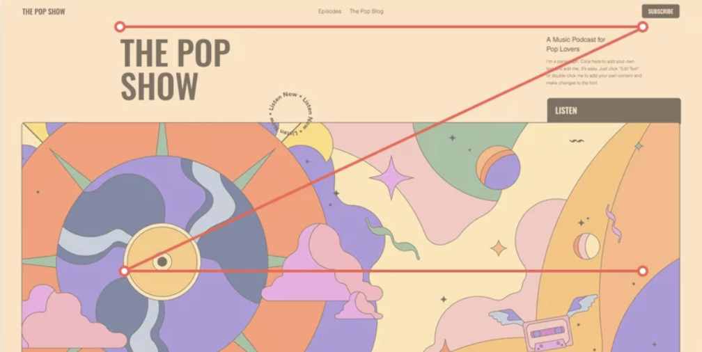
The Z-Pattern Layout is one of the most popular layout styles. It uses what we call the “Z-pattern” to arrange content in a visually pleasing way that makes it easier for users to scan and digest information. When coming across a new webpage, we immediately glance over it to take in the gist of things. This speedy scan, called skim reading, is often done in the shape of the letter Z or in zig-zag form. Our eyes move from the top left corner to the top right corner, then down to the bottom left, and finally to the right again. The Z-pattern website layout utilizes this reading habit by spreading important information across a Z shape.
Using this layout, a logo is usually placed in the upper left-hand corner of the homepage, so that it registers first. Across from it, in the rightmost corner, it’s common to place the navigation menu along with a prominent call-to-action.
Fullscreen image layout
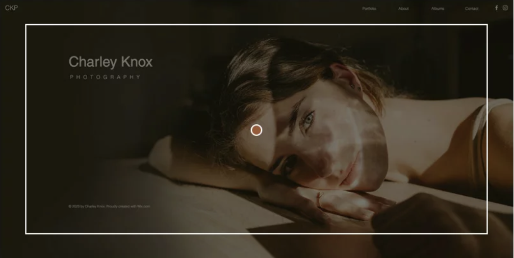
When you want your website to get noticed, an extra large visual placed front-and-center can be a great way to go. This is a fullscreen image layout, so it's great for showing off all the best parts of your business in one glance.
This layout works well on desktop and laptop computers, but also looks great on mobile devices. You can use any type of visual you want—from a photograph to an illustration or video—as long as it's high quality and relevant to your service or product.
A fullscreen image layout is great for businesses that want to highlight a specific niche or product and who have great visuals in their arsenal of marketing assets. Your fullscreen image should also be accompanied by a short line of text to further explain what the site is all about. Craft a strong header or a catchy slogan to introduce what you offer as a business, exciting visitors to explore more.
Split screen layout
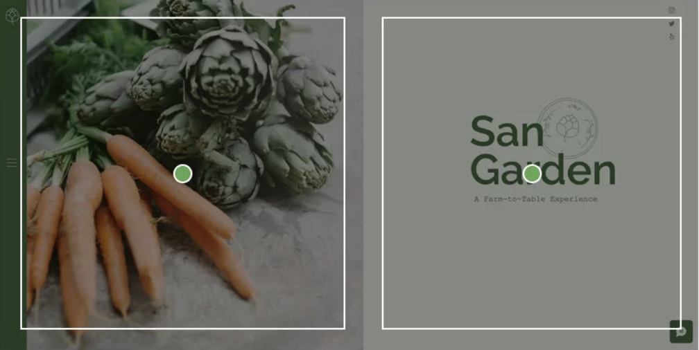
The split screen layout is one of the most popular design arrangements out there. It’s a simple and effective way for sites to present content by splitting the screen down the middle, creating a perfectly symmetrical balance that allows each section to express an entirely different idea—or alternatively, to support one idea from two different angles.
The website layout template shown here presents a dining experience with an eye-catching visual to the left, and text and matching vector art to the right. The layout enables both sides to fully complement each other, rather than compete for attention. This same design can also work well in cases where site visitors are asked to choose between two opposing options, such as ‘Men's’ and ‘Women’ categories in an eCommerce website.
Thanks for reading :)


